
Palette decisions you can test
Pixel Art Color Palette Guide
Choose colors for readable shapes, then verify what survives conversion and export. This guide uses the actual pixel art maker and explains where its automatic palette stops being the right tool.
Try the palette settingsThree real conversions, with both settings disclosed
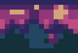
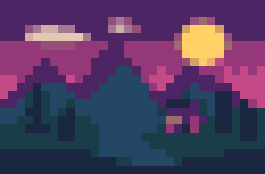
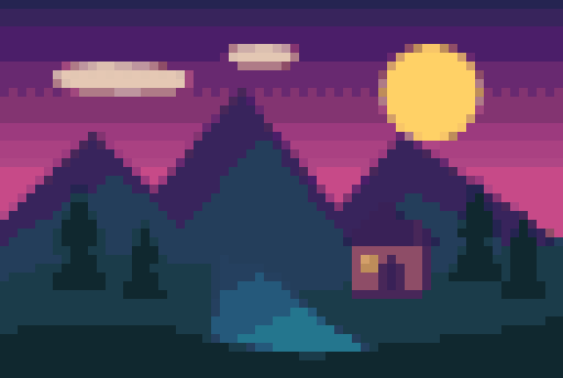
All examples come from the same 768 × 512 source scene and the site's converter. Grid size and color budget both vary here, so these images are not evidence of color count alone. Download a source and follow the fixed-grid test below for your own comparison.

1. Give each color a job
Start by identifying the background, subject silhouette, shadow, midtone, and highlight. These are visual roles, not a rule that every image needs five colors. Two neighboring colors that look nearly identical at delivery size may use up the palette without clarifying a shape. Keep colors that separate important objects before adding subtle texture.
2. Hold the grid constant during a palette test
Open the pixel art maker and use its sample or your own source. Set a 32-pixel grid, choose 8 colors, and convert. Save that result, then repeat at 16 colors without changing the source, grid, or export scale. This isolates the palette budget. If you change grid and colors together, you cannot tell which setting recovered a missing detail.
3. Compare shapes before smoothness
Inspect the smallest feature that must remain readable: a face, letter, handle, or gap between branches. If an 8-color result merges that feature into its surroundings, try 16 colors. More colors can retain gradients, but they can also preserve unwanted photographic noise. Prefer the smallest budget that keeps the intended shapes distinct.
4. Know what the automatic palette does
The converter derives a palette from the source colors and maps pixels to it. With the optional grid overlay off, its color control is an upper budget for the quantized RGB colors, not a promise that the image will use exactly that many. Turning the overlay on composites semi-transparent grid strokes over those colors and can create additional RGB values in the exported PNG. The tool does not let you import a fixed palette or hand-pick every swatch. When a game or brand requires exact color values, finish the result in a palette-aware editor.
5. Keep transparency separate from RGB colors
A transparent pixel is not a white color swatch. Partly transparent pixels can make one RGB color look different on light and dark backgrounds. Check the exported PNG on both surfaces before concluding that the palette changed. For a crisp sprite edge, decide deliberately whether soft alpha belongs in the asset instead of flattening everything onto white.
6. Export without adding accidental colors
Use the tool's PNG export and an integer output scale. Keep the optional grid overlay off for a clean asset, because grid lines become part of the output. Avoid taking a screenshot or converting the sprite to JPEG: scaling and compression can change the appearance. Preserve the small source grid alongside the presentation-size export.
7. Distinguish a reduced palette from indexed storage
An image can use only a few visible colors while still being saved as an RGBA PNG. This browser tool reduces the visual color set; it does not promise an indexed-color file or a hardware-specific palette format. If your engine requires palette indices, convert and verify the file in an editor that explicitly supports indexed color before importing it.
8. Choose the next edit from the visible failure
If edges are blocky in the wrong places, revisit the source crop or grid size. If shapes are correct but blend together, revisit the palette or edit individual colors manually. If the exported result looks blurred only after placement, check the destination's scaling. These are different problems, and raising the color count will not solve all three.
For the storage distinction, see Aseprite's official color-mode documentation: indexed pixels refer to palette entries.
Palette FAQ
How many colors should pixel art use?
There is no universal number. Begin with a small budget such as 8 or 16 for a conversion test, keep the grid fixed, and increase only when important shapes become indistinguishable.
Can I upload my own palette to this tool?
No. The current pixel art maker derives colors from the source. Use a palette-aware editor if you need exact swatches, palette import, or indexed-color output.
Are the three examples a controlled color comparison?
No. They use different grid sizes and color budgets. They demonstrate combined settings. The fixed-grid steps above describe how to test color count independently.
Will a 16-color setting always create 16 unique colors?
No. With the grid overlay off, 16 is an upper budget for the quantized RGB palette, and a simple source can use fewer colors. With the overlay on, semi-transparent grid strokes blend with underlying colors and can create additional RGB values in the exported PNG.